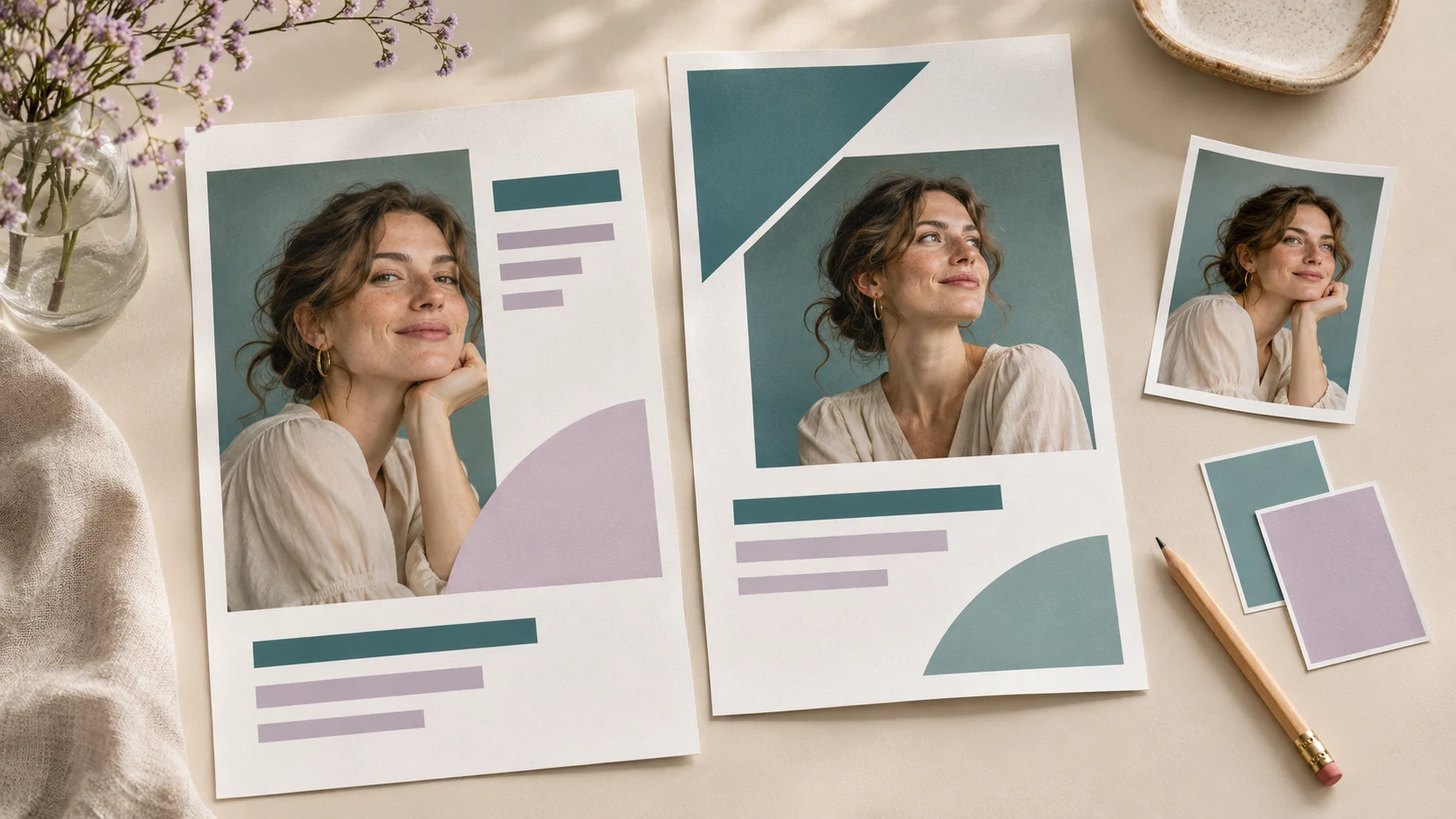
A business flyer has a small amount of space to answer three questions. What is being offered? Why should someone care? What should they do next? A clear layout helps a reader find those answers quickly, whether the flyer appears on a phone or on a noticeboard.
For this practice project, imagine a local photography studio promoting a portrait session. You will plan the message, arrange the main elements and use Photoshop to assemble a design that is easy to revise.
Prepare the content before opening the canvas
Write the final headline, a short description of the offer, any essential details and one contact action. For a fictional exercise, you could use “Your next portrait starts here,” followed by a short description and a booking instruction. Keep practice prices and contact details clearly separate from anything you plan to publish.
Choose one strong photograph that supports the offer. Gather the correct logo and confirm that the image can be used for the project. Having these assets ready makes it easier to judge the space the layout needs.
Choose the destination and dimensions
Decide whether you are making a digital flyer or a printed piece before setting up the document. A social post, a story and a printed handout need different proportions. For print, ask the printer for the required dimensions, bleed, colour setup and export format.
For your first exercise, work on one format. Sketch a layout with a headline at the top, a prominent portrait in the middle and a booking area near the bottom. Mark a comfortable margin around the outside so important information has room to breathe.
Establish a clear reading order
Make the headline the first thing a reader notices. Give the photograph enough space to support it, then group the offer details and contact action. Use differences in type size, weight and spacing to show which information comes first.
Limit the number of type styles in the practice design. Try one family for the headline and one for supporting text, or use different weights from a single family. Check the layout at a smaller viewing size. If every line competes for attention, reduce the emphasis on supporting details.
Use a clipping mask to contain the photograph
A clipping mask reveals an upper layer through the non-transparent content of the layer beneath it. In a flyer, you can use a shape as the base and place the photograph above it, allowing the image to sit inside that shape. Adobe explains the layer relationship in its clipping-mask guide. See Adobe’s clipping-mask instructions.
For the exercise, try a simple rectangle with generous proportions. Reposition the photograph within the composition so the face has comfortable space and the crop feels intentional. A decorative shape is only useful if it supports the image and the reading order.
Organise the file for revisions
Name the main layers or groups Headline, Portrait, Offer, Logo and Contact. Keep text editable and save a layered working file. If the client changes a date or replaces a photograph, this structure makes the relevant content easier to locate.
Use a small colour palette drawn from the brand or photograph. Check that supporting text is readable against its background. If the photograph has a busy area behind text, move the text or give it a simpler background.
Check the flyer before exporting
Read every word aloud, confirm the contact details and check alignment. Look at the design on a phone if that is where it will be shared. For print, review a proof at the intended physical size and follow the printer’s specifications.
Export a delivery copy and keep the editable Photoshop file separately. Open the exported copy to confirm that the crop, text and image quality match your intended result.
Build your first finished flyer
Create two versions using identical copy and imagery. Change only the headline position and compare which version communicates the offer faster. Ask a reader to identify the offer and contact action after a quick glance.
Follow the Creative Business Flyer Tutorial on Skillzz Up to see a Photoshop flyer take shape through practical tools and techniques, including clipping masks. Pause as you work and apply each step to your own layout.
